• PORTFOLIO (2019-2025)
• PORTFOLIO (2019-2025)
• PORTFOLIO (2019-2025)
• PORTFOLIO (2019-2025)
• PORTFOLIO (2019-2025)
• PORTFOLIO (2019-2025)
• PORTFOLIO (2019-2025)
• PORTFOLIO (2019-2025)
• PORTFOLIO (2019-2025)
• PORTFOLIO (2019-2025)
• PORTFOLIO (2019-2025)
• PORTFOLIO (2019-2025)
• PORTFOLIO (2019-2025
)
SAMBACATU
"Sambacatu" is a college project developed as a group with the objective of creating a brand. In my case, we ended up creating a design studio focused on the cultural sector, aiming to support brands that strengthen Brazilian culture.
FEITO POR: BEATRIZ SIMÃO, DANIELLA ROSSETTO, EDUARDO DAL MAS EULÁLIO E LETICIA ASSALIN.
CREATED BY: BEATRIZ SIMÃO, DANIELLA ROSSETTO, EDUARDO DAL MAS EULÁLIO, AND LETICIA ASSALIN.
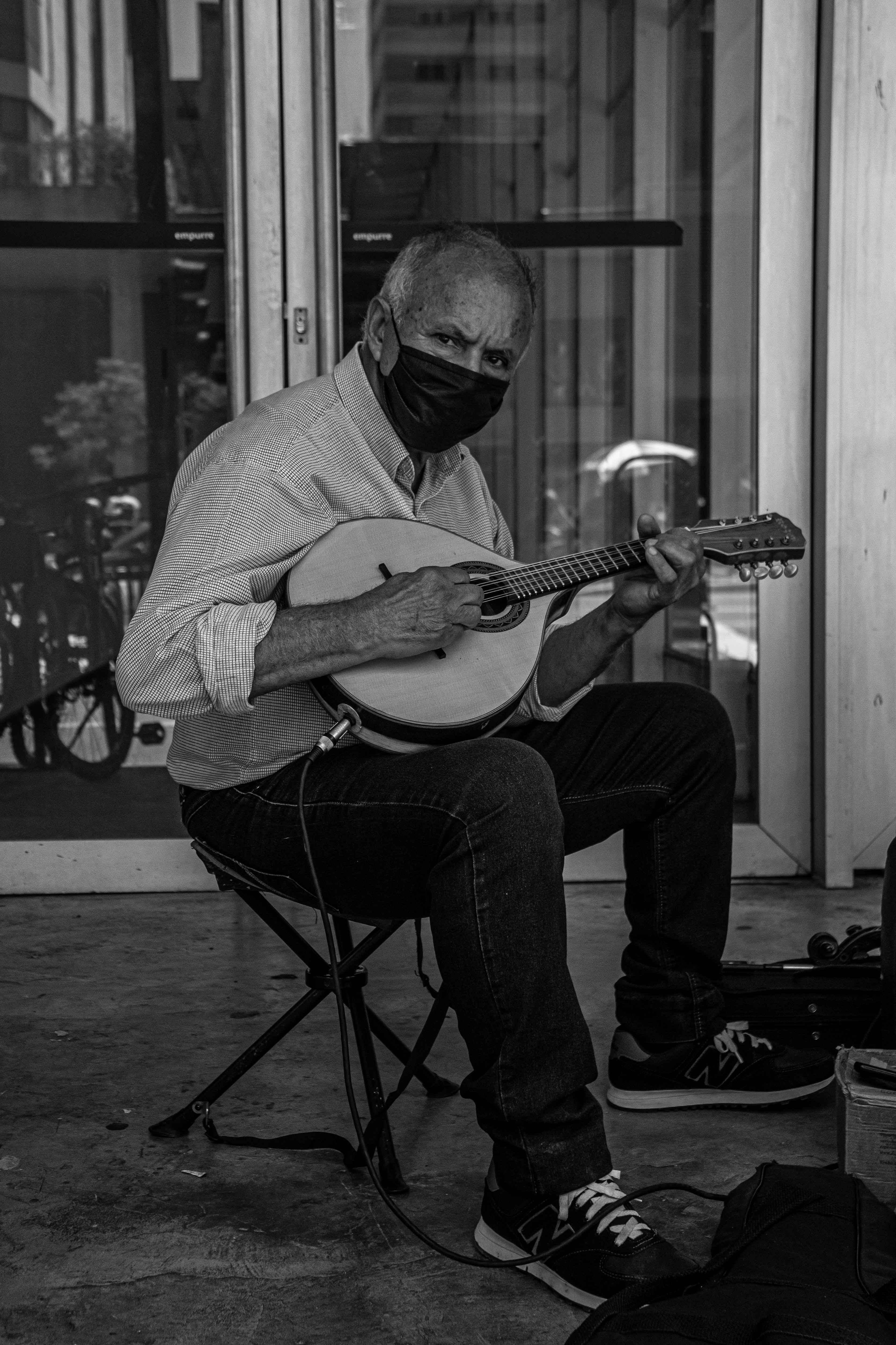
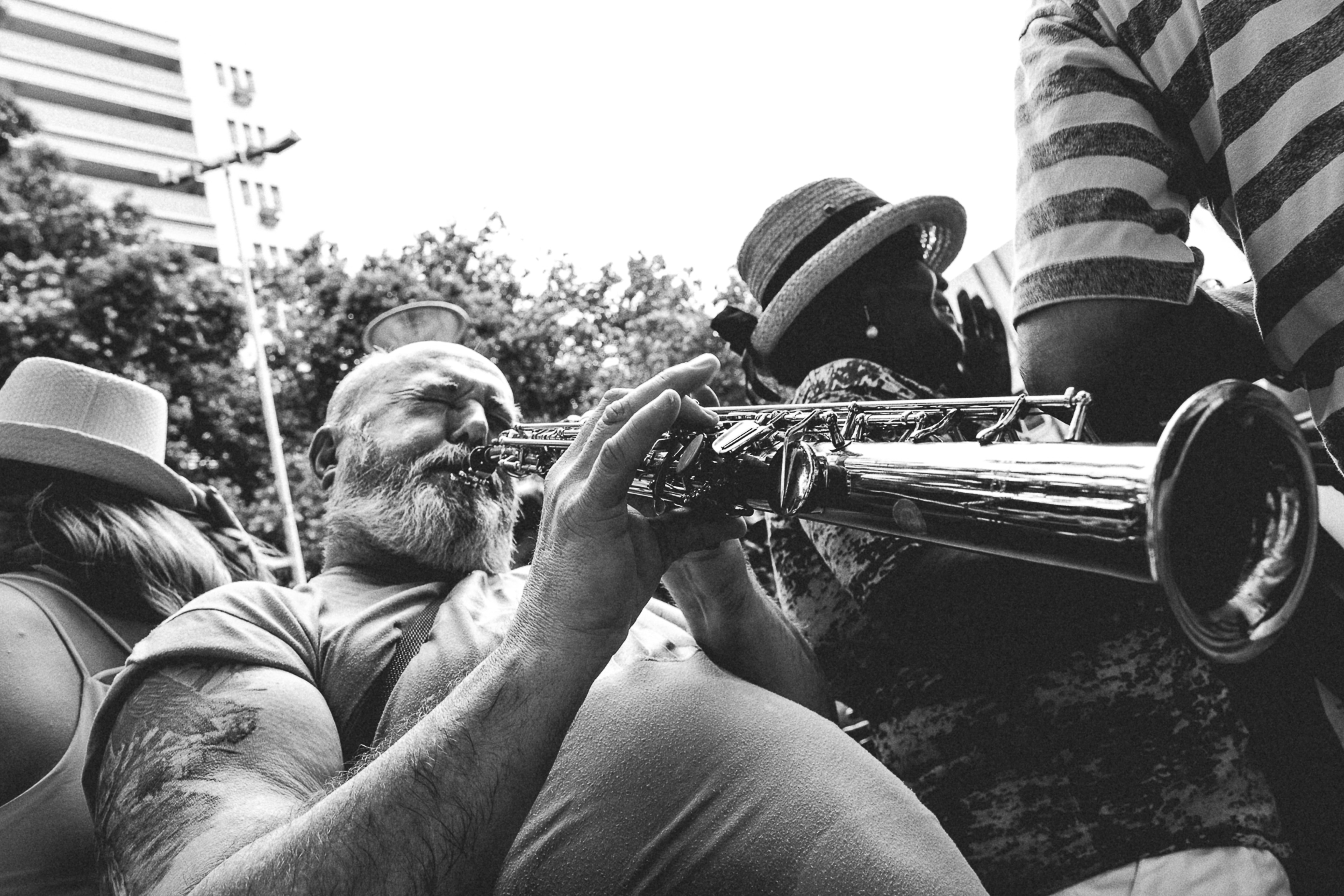
Starting with the purpose of "provoking ideas is in our culture," we began developing the brand with a focus on the cultural sphere and an association with Brazilian diversity. After discussions, we concluded that Brazilian music and percussion, specifically "batuque," would be a great direction. It would bring energy and diversity to the brand.
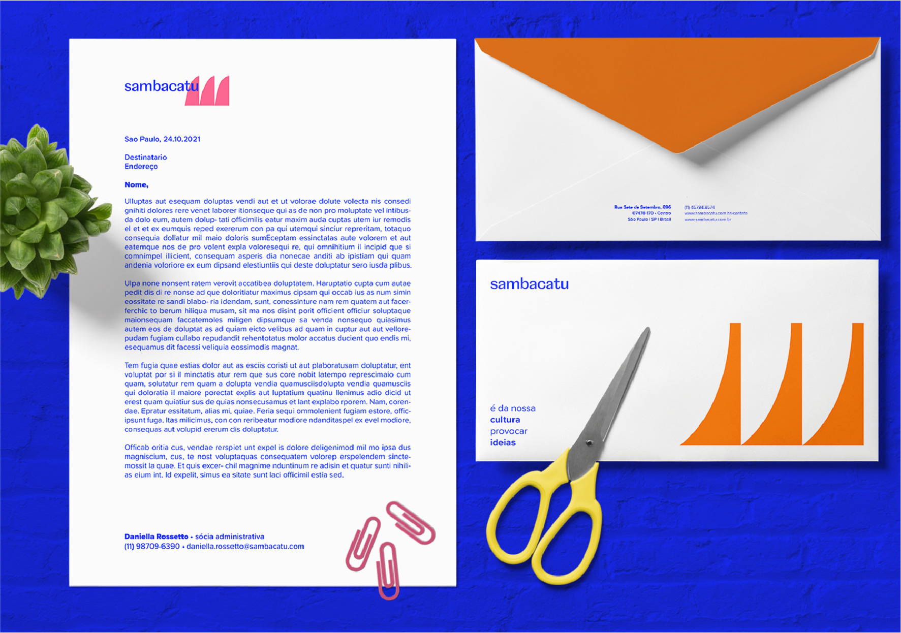
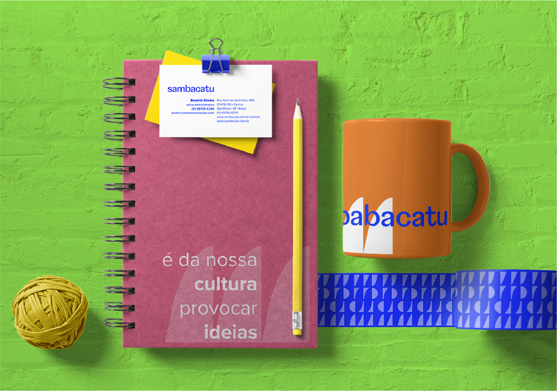
The initial construction of the brand began with a brainstorming session for the name. We arrived at "sambacatu." The name carries an obvious reference to "samba," but it also brings with it the idea of percussion and sound. Each syllable can be interpreted as the sound of a beat.
With this in mind, we assigned a shape and a color to each syllable, which were associated freely with how we interpreted the sound of each syllable. In the end, the brand is not just the symbol, typography, or colors; it represents the idea of percussion and sound. Therefore, we designed and distorted the brand to its limits, playing with its sound and applications.
IMAGENS
︎

