• PORTFOLIO (2019-2025)
• PORTFOLIO (2019-2025)
• PORTFOLIO (2019-2025)
• PORTFOLIO (2019-2025)
• PORTFOLIO (2019-2025)
• PORTFOLIO (2019-2025)
• PORTFOLIO (2019-2025)
• PORTFOLIO (2019-2025)
• PORTFOLIO (2019-2025)
• PORTFOLIO (2019-2025)
• PORTFOLIO (2019-2025)
• PORTFOLIO (2019-2025)
• PORTFOLIO (2019-2025
)
GIULIA
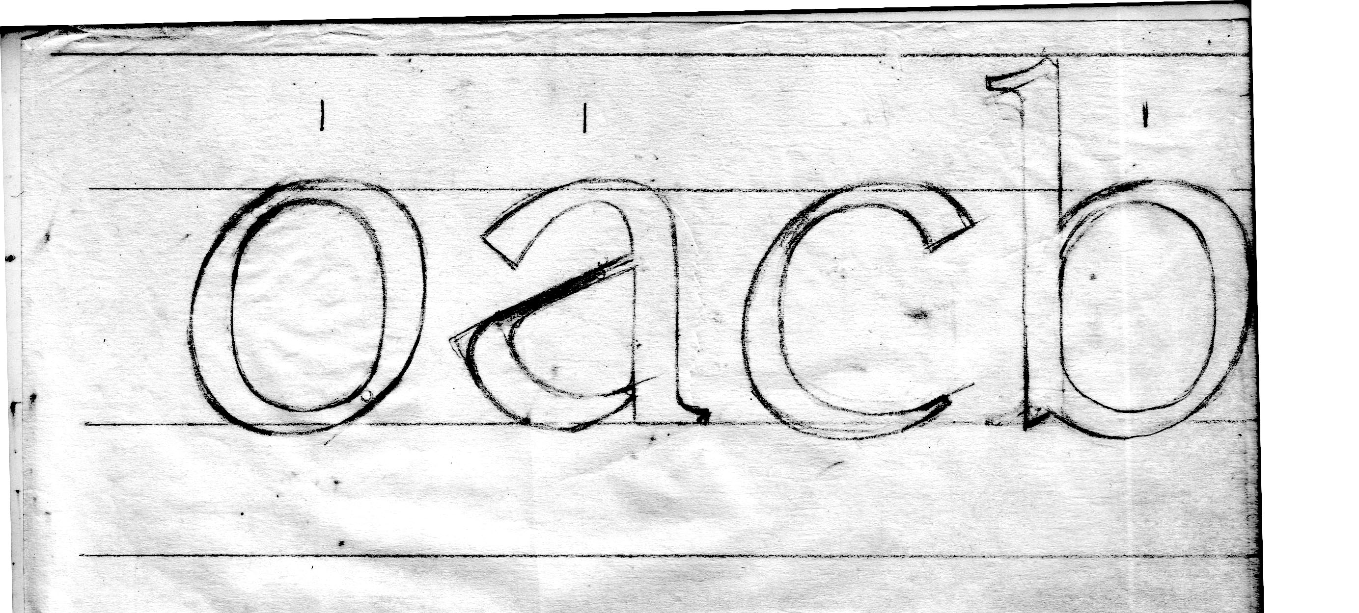
"Giulia" is a Roman typeface of medium weight, with a relatively short x-height, designed for text composition. Inspired by classical aesthetics, it features strong contrast, a noticeable mid-axis, and baroque serifs. It stands out for its more modern aspect through its semi-expanded appearance and pointed terminals, which contrast with the rest of the typeface.
4th AND 5th SEMESTER PROJECT
This was one of my favorite projects where I could explore topics I always wanted to learn about, understanding what good form means in typography and its nuances. The project began with calligraphic work, using a nib and ink, where I drew various letters until achieving a result on which I would base the typeface. Next, we moved on to a more refined drawing with a mechanical pencil, correcting small details and refining general letter characteristics, such as serifs and terminals. Finally, on the computer, we vectorized all the letters and developed accents and numbers, as well as a bold version of the typeface.
IMAGES
︎


