• PORTFOLIO (2019-2025)
• PORTFOLIO (2019-2025)
• PORTFOLIO (2019-2025)
• PORTFOLIO (2019-2025)
• PORTFOLIO (2019-2025)
• PORTFOLIO (2019-2025)
• PORTFOLIO (2019-2025)
• PORTFOLIO (2019-2025)
• PORTFOLIO (2019-2025)
• PORTFOLIO (2019-2025)
• PORTFOLIO (2019-2025)
• PORTFOLIO (2019-2025)
• PORTFOLIO (2019-2025
)
PENA FLAMENCA
"Pena Flamenca” é uma associação socio cultural sem fins lucrativos, com o objetivo de difundir o flamenco no Brasil.
"Pena Flamenca" is a project that I both like and dislike at the same time. While I believe it could have had much more interesting versions, its final version still pleases me to some extent. With the brief to convey the passion and energy of flamenco, I tried to take a path that brought movement and energy while still maintaining a contemporary touch.
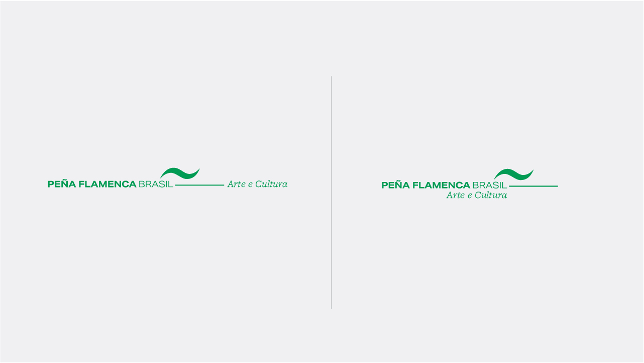
The symbol corresponds to the guitar, an instrument of great importance in flamenco, as well as the movement of dance and a reference to the "~," which can be associated with the Spanish language. The initial study used the color red, which was later changed to avoid the obvious (Spain ~ flamenco) and give the brand more authority. After discussions, the client recognized the need to emphasize the silhouette of the guitar.
IMAGES
︎


